The Smooth Earth
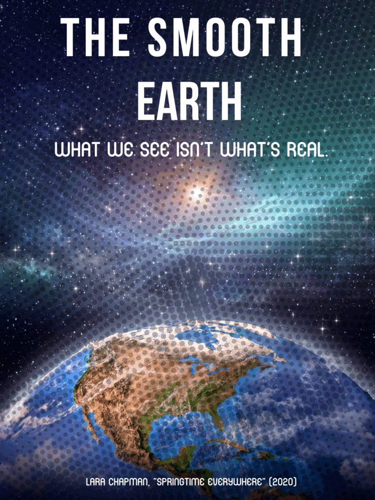
I picked the phrase “The Smooth Earth” from Lara Chapman’s Springtime Everywhere because it just sounded like a movie. It feels clean and chill, but the more you think about it, it’s kind of creepy. The whole essay talks about how Google Earth edits out all the messy, uncomfortable stuff, clouds, disasters, the “unsmooth” parts of reality, and replaces it with this perfect, filtered planet. It’s basically Earth with an Instagram filter slapped on it. So yeah, “The Smooth Earth” felt like the perfect title for a film that exposes how tech companies make everything look beautiful to distract us from what’s actually happening.
For the poster, I wanted to play with that contradiction. I used an image of Earth that looks hyper-polished, bright greens, deep blues, but then layered in faint cracks and glitch textures. It’s subtle, but once you notice it, you can’t unsee it. That’s the whole point: what looks “real” might actually be a curated illusion.
I used a super clean and modern font, kind of like the typography in Apple ads. It gives off that tech aesthetic, smooth, confident, a little cold. Then I added a reflective gradient so the title almost looks metallic. It’s supposed to feel satisfying but sterile, just like the kind of digital “smoothness” Chapman critiques.
My tagline is: “What we see isn’t what’s real.” It’s short, dramatic, and exactly what Chapman is getting at, that clarity can be deceptive when someone else is controlling what you see.
Overall, I wanted the poster to feel too perfect, almost suspiciously so. Chapman’s essay really stuck with me because it’s not just about maps, it’s about how comfort and convenience can dull our awareness. “The Smooth Earth” is what happens when we let aesthetics replace truth. I think the poster captures that tension: it’s pretty, but it’s also lying to you.